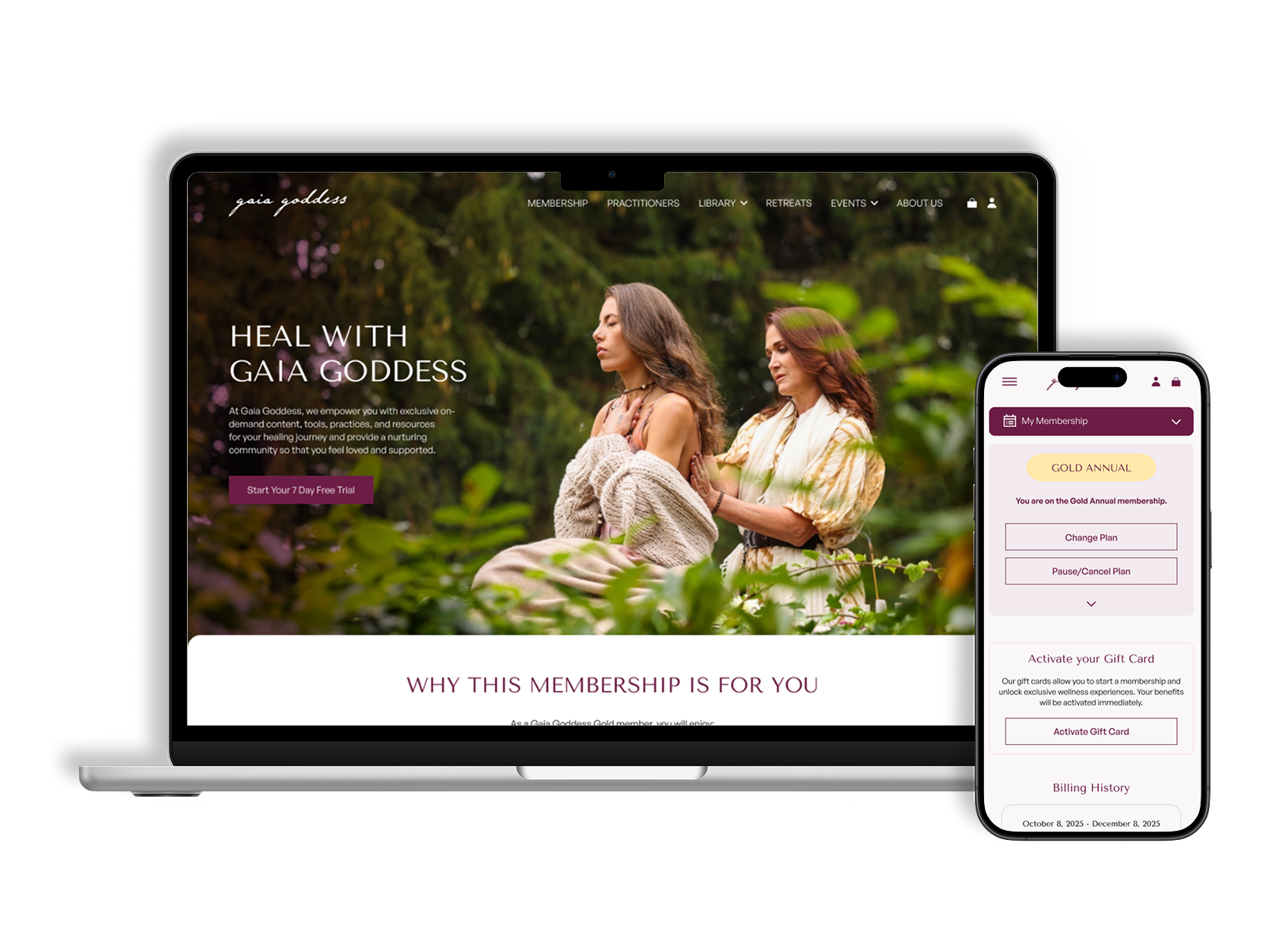
Conversion and Subscription Management

Conversion wasn't failing for lack of interest. It was failing at the moments that demanded the most confidence.
Why it matters — in a subscription, the product is sold three times: when someone chooses a plan, when they confirm it, and every month they decide to stay.
Product Designer, end-to-end · engaged by Plus972
Full membership flow, functional prototype, documented handoff
Tested with 8 people · no live analytics yet
The decision I'd defend — reassurance always comes before commitment.

Hypotheses written, data still to collect
The membership flow was designed end to end — the three sign-up paths, complete subscription management, a functional prototype and a handoff documented component by component.
What the design put in place was one principle applied everywhere: reassurance comes before commitment. Every decision moment answers the question the person has at that moment, and not one screen later.
Eight people tested it, and the principle held — seven of eight could say what they'd be charged and when, before they were asked to pay. What the test also found is the part that isn't finished: the billing line is understood by people who read it, and still missable by people who scan. The next iteration doesn't add information. It makes what's already there harder to miss.
Thanks to Plus972 and the Gaia Goddess team, for treating subscription management as part of the product rather than the page you hide.
The Problem
Gaia Goddess is a wellness membership platform — a content library, practitioners, retreats and workshops, with three plans and a seven-day trial.
The platform covered all three selling moments. It covered them badly, and each one failed differently.
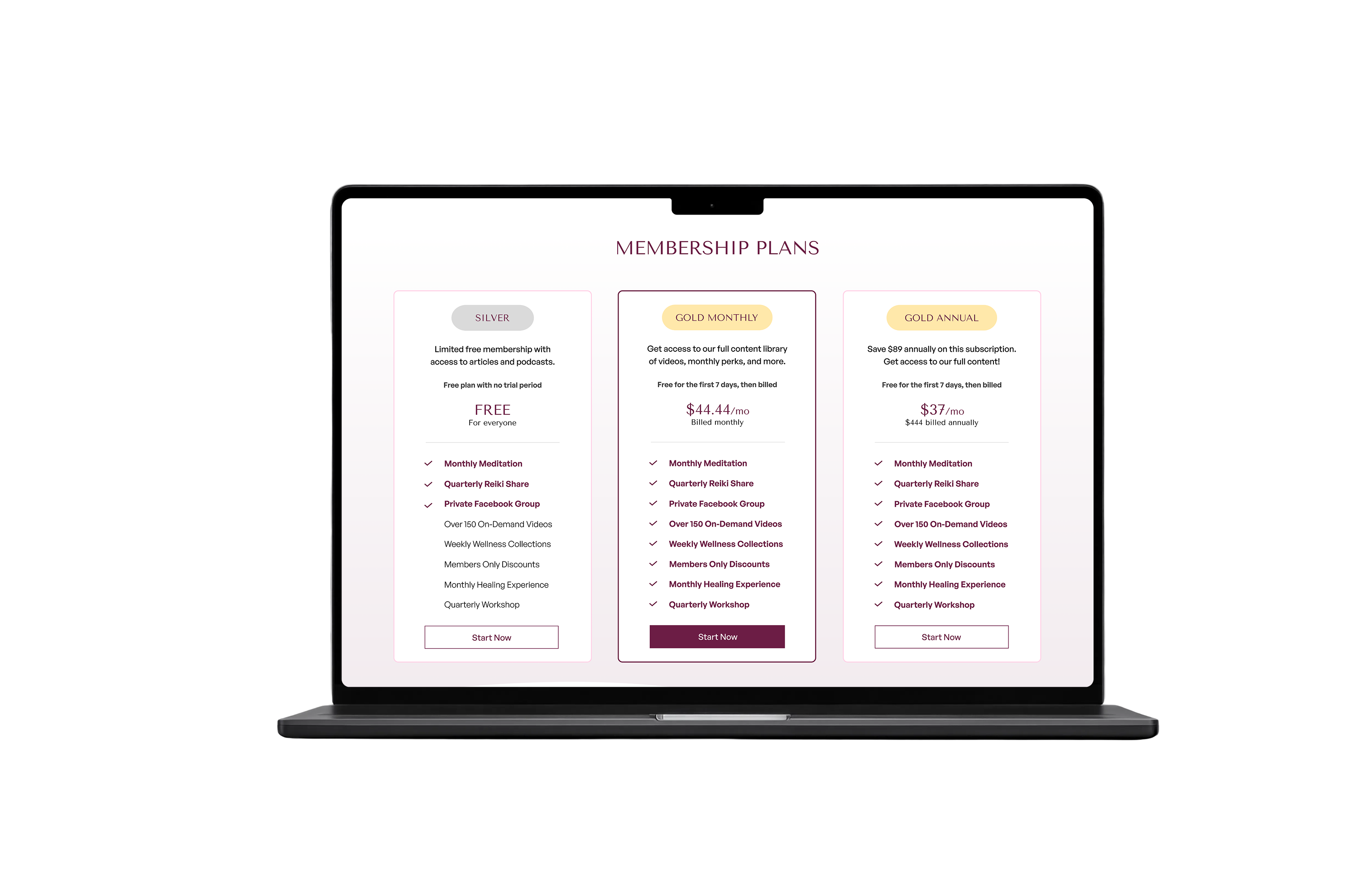
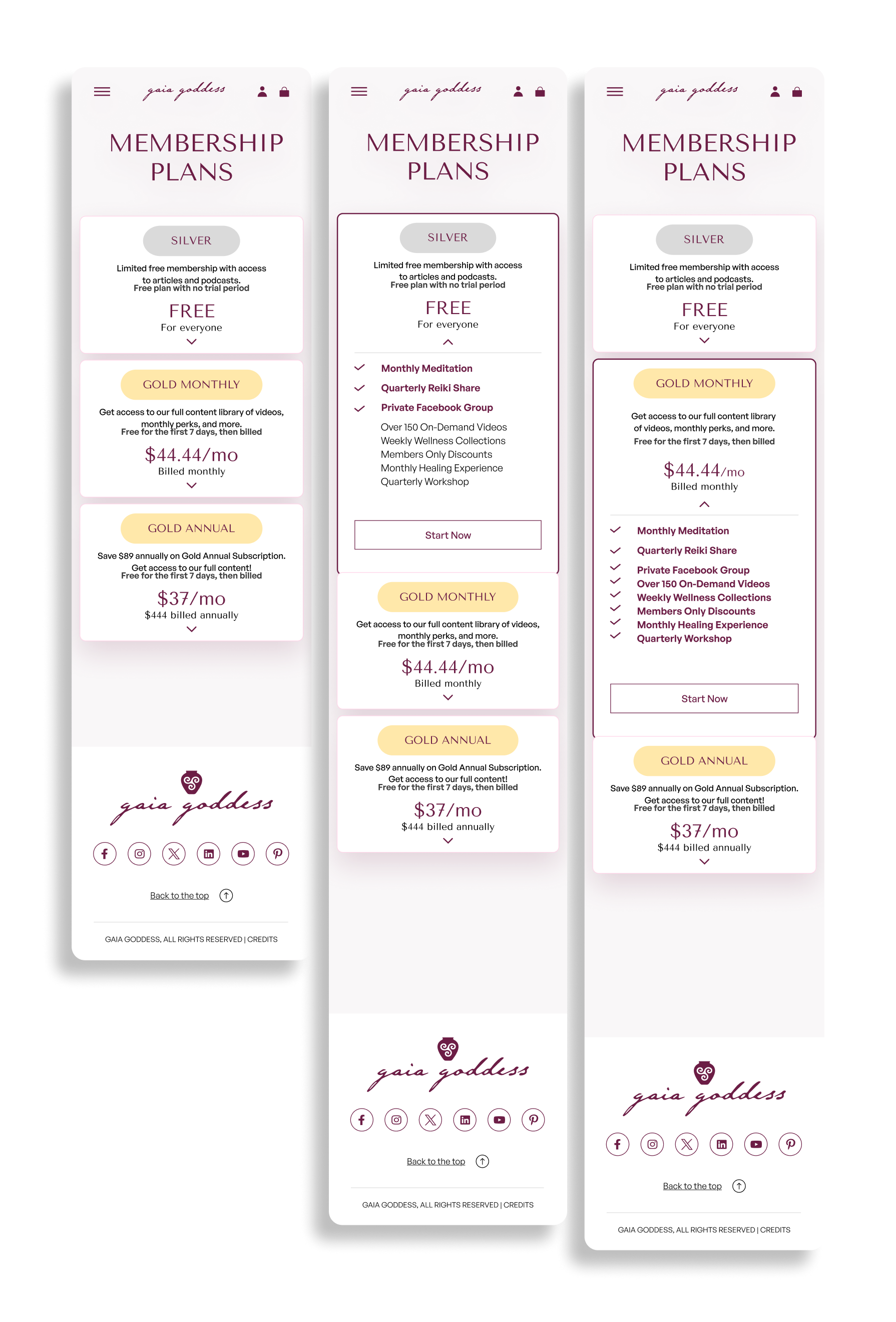
On the plans page, people arrived, saw three similar options at similar prices, and left without choosing. The platform couldn't explain its own value at exactly the moment it most needed to.
In sign-up there was an email confirmation step — necessary, for security. Whoever left there didn't come back, because nothing told them the account already existed and the process was incomplete but recoverable. A step of progress was being experienced as an ending.
In subscription management, a platform update had left the member area out of sync: anyone trying to change, pause or cancel found an interface that no longer matched what they'd signed up for.
A constraint from the start: these flows lived inside a platform with no design system and no documented patterns. Adding a new pattern to a fragmented system only increases the fragmentation, so the existing components had to be audited before any screen.
I didn't benchmark other wellness platforms. What Gaia Goddess shares with them is subject matter; the problem to solve was a subscription problem, which repeats in any category. We matched the conventions of subscription products on plan presentation, and differentiated on treating subscription management as part of the product rather than the page you hide.

My Role
End-to-end Product Designer for this scope: research synthesis, information architecture, wireframes, high-fidelity UI, interactive prototype and handoff.
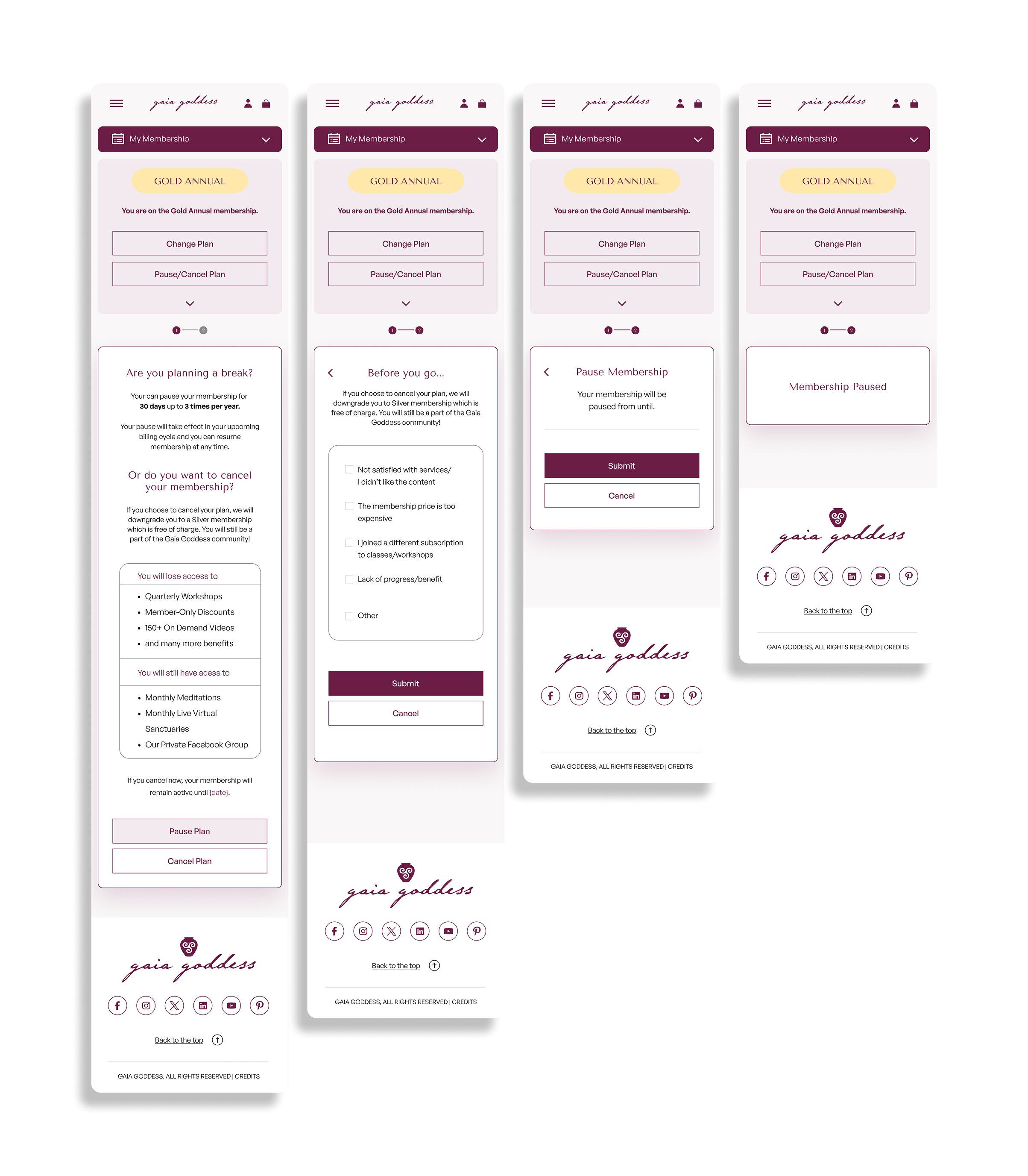
The prototype covers the complete membership flow — the three sign-up paths and every management action: change plan, pause, cancel, activate a gift card, view billing history.
The handoff was built to reduce developer interpretation to zero. I documented every new component and ran a dedicated session on the management flows before any code was written, because one component renders differently depending on whether the plan is the user's own — an interface decision with a direct consequence in front-end logic, and one I flagged rather than discovered later.
The System
Three decision moments, one principle applied at each: reassurance comes before commitment.
The research said the same thing in four ways, and none of them were about content. People don't abandon because the product is wrong. They abandon because the interface doesn't answer the question they have at the moment they have it. It's a failure of timing — the information exists, it just arrives late.
Reassurance about the trial has to appear before the payment screen, not on it. Anyone reaching payment with doubts about when they'll be charged is already deciding out of fear.
Someone reading a plans page wants one clear reason to act, not a full comparison. An exhaustive table looks like rigour and produces paralysis.
In a plan change, three answers are needed before confirming: what changes, when it takes effect, and what happens to billing. If one is missing, the person doesn't confirm.

Decisions
Plans that show the difference, not the list. All three keep the full list, but with visual hierarchy: what distinguishes a plan from the one below carries weight, what was already there recedes. The hard part was making sure a muted item read as not included in this tier rather than unavailable — solved with copy and iconography, not colour.
An email confirmation that says where you are. The page stopped being technically correct and became informative: the account has been created, it's waiting for confirmation, the process is incomplete but recoverable. The step didn't change. What it communicates did.
Knowing where you are before deciding where to go. In subscription management the active plan lost its button and gained a Current Membership label. The other two show the explicit action — Change to Silver, Change to Gold Monthly. It costs a conditional component with three states. It removes all ambiguity about where the person stands.
Reassurance before commitment, applied four times. Trial terms appear before the payment screen. The billing implication appears before the plan is chosen, not on the confirm button. It's the same principle repeated, and it's what gives unity to flows that used to behave like three different products.
Pausing as a real alternative to cancelling. Someone trying to cancel doesn't always want to leave — sometimes they want to stop for two months. Before confirming, they see what they lose and what they keep, and can suspend for 30 to 90 days. It isn't a retention barrier. It's an option that didn't exist. Whoever does cancel says why, in a short question that feeds the next product decision.
Trade-offs
Risks named during the decision, and what I'd watch in implementation.
Alternative — the whole list with equal visual weight in every plan.
Decision — hierarchy separating what's new in this tier.
What it costs — far more careful component design, so a muted item doesn't look unavailable.
What I'd monitor — whether the differentiation ever relies on colour alone, which fails for anyone who can't distinguish it.
Alternative — the standard confirmation page, technically correct.
Decision — a progress-aware page.
What it costs — more copy and more states to design and maintain.
What I'd monitor — whether drop-off at that step actually moves. It's the point that motivated the project.
Alternative — show three plans equally and let people infer which is theirs.
Decision — an explicit indicator on the active plan.
What it costs — a conditional component with three states, with front-end logic implications.
What I'd monitor — whether the three states stay distinguishable as the plan structure changes.
Alternative — design the new flows and sort out coherence later.
Decision — audit the existing components first.
What it costs — delays the start of visible work.
What I'd monitor — whether the new flows end up adding patterns to the fragmentation instead of reducing it.
Testing & Metrics
Usability test run with 8 participants · product analytics not yet instrumented.
To test whether the redesigned flow gave people enough confidence before each commitment point, I ran a lightweight usability test with eight people who had previously paid for at least one subscription service. Remote and unmoderated — participants received the interactive prototype and completed four tasks covering plan selection, payment, subscription management and email confirmation.
What I tested, and what came back
Task — choose a plan for yourself and explain why.
Result — 6 of 8 decided primarily from the highlighted differences between plans. 2 of 8 worked through most of the feature list first.
What it supports — giving visual weight to what changes between tiers rather than treating every feature equally.
Task — stopped just before the pay button: when will you be charged, and how much?
Result — 7 of 8 answered correctly without scrolling back. The one who couldn't knew there was a trial, but not when the first payment would land.
What it supports — the core hypothesis. Billing was understood at the moment of the decision rather than discovered afterwards.
Task — you want to stop for two months. Do that.
Result — 6 of 8 found pause before considering cancellation. The other two headed for cancel, noticed pause before confirming, and completed the task.
What it supports — pause reads as an alternative to leaving, not as something buried inside the cancellation flow.
Task — on the confirmation screen: what just happened, and what happens now?
Result — 7 of 8 understood the account existed but still needed email confirmation. One read the screen as the end of the process and only understood the next step after reading the supporting copy.
What it supports — making the state explicit: incomplete, but recoverable.
What changed because of it
The test didn't invalidate the direction, but it exposed one remaining weakness: the billing information can still be missed by people who scan rather than read.
The main hypothesis held — people understood the commitment before making it. So the next iteration doesn't add information. It makes the existing billing line harder to miss.
What I'd still instrument
Eight people is enough to see a problem and never enough to size one. Comprehension is not behaviour. These are the three numbers I'd want once it's live.
Hypothesis — current-plan visibility reduces decision time.
Test — session recording analysis.
Metric — average time between page load and the click on Change Your Membership Type.
Hypothesis — billing information before the choice reduces abandonment at confirmation.
Test — A/B with and without the line.
Metric — confirmation completion rate.
Hypothesis — pausing captures people who'd otherwise leave permanently.
Test — cohort tracking on pause against cancel.
Metric — share of pause users who resume within 90 days. Below roughly a third, pause isn't retaining anyone — it's delaying churn and complicating the flow.

Learnings
Planning measurement is work for the design phase, not for after launch. I left the project with clear hypotheses and no instrumentation behind them. The usability test only exists because I went back for it — asking how will we know this worked at the start would have changed the decisions I made along the way.
In a subscription, the problem is rarely the argument. We always start by treating the plans page as a piece of persuasion. It was a piece of orientation: people didn't need convincing, they needed to understand what they were choosing. The test bore this out — most participants never read the full feature list.
An interface decision can be an architecture decision. The active-plan label looks cosmetic and forces the component to render differently depending on the user's context. I caught it in time and took it into handoff with a session of its own — unnoticed, it would have surfaced as a bug three weeks later.
What's still open
The test measured comprehension, not behaviour. Eight people understood the billing line when asked. Whether that moves conversion is a different question, and it needs live data over weeks rather than eight sessions.
The component audit reduced fragmentation in this scope, not in the platform. The rest of the product still has no design system, and these flows will drift from it again without one.
Pause is the riskiest decision here. The test showed people find it and understand it. It didn't show whether they come back — and its failure mode, delaying churn rather than preventing it, looks like success on a monthly chart.